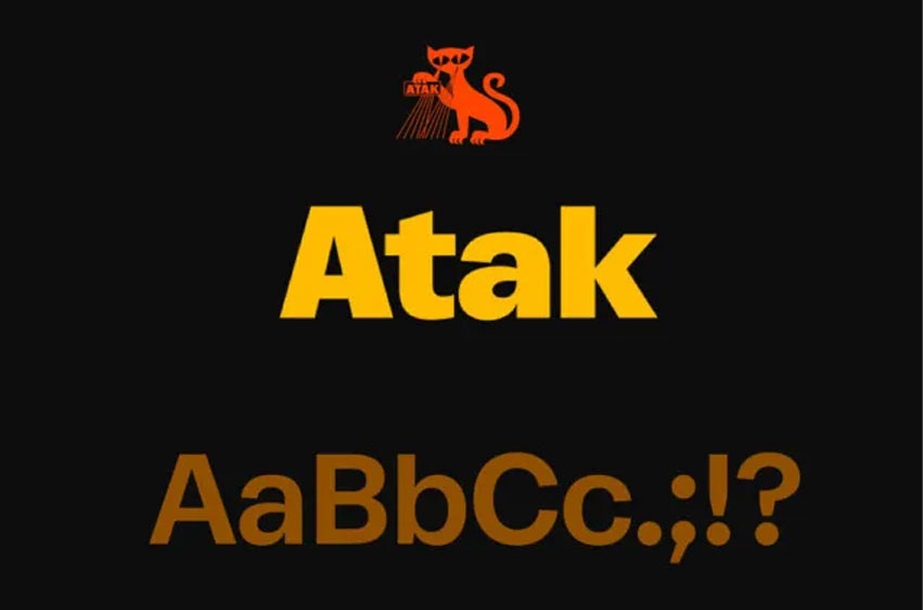
Atak Font Family evolved from the need for a sans serif type family which offers bold weights with a distinct originality instead of being just the fattened versions of their Regular counterpart. Plakat Black with its vivid and variable stroke widths seemed to be the perfect starting point. To achieve a more flexible and text-orientated design, Plakat Black was reworked from scratch. The proportions, stem widths, intersections, and counters were carefully redesigned towards a more robust typeface working in every type size. Its redesign also results in more dynamic curves with lesser wood-type appeal and a more contemporary aesthetic.
Atak Black has rather wide dimensions compared to the normal width of the Regular weight. This is without losing the family’s natural graduation when it comes to interpolation. On the contrary, by taking the space it needs, the heavier weights avoid undefined, ambiguous designs. At all times, the aim was to create bold and compact letterforms by keeping their specific character, which gives Atak an overall nuanced and concise look. Its idiosyncratic forms result in a powerful and welcoming grotesque family with a comprehensive range of weights from Light, Regular, Medium, Semibold, and Bold to Black.
Atak Font Preview

Personal Use Only






Leave a Reply