


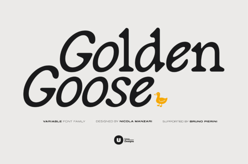
Golden Goose Font is a serif with a hand-made touch that reimagines the italic. Instead of offering a traditional oblique, the Golden Goose font hybridizes italic behavior directly into the regular: all-around letters adopt a calibrated slant that creates a distinctive, organic flow while preserving serif structure. The result is an original typographic voice with a lively texture and confident readability, effective both in display and in print.
Crafted with artisanal care for curves and terminals, Golden Goose strikes a balance between energy and control. The built-in slant guides the eye along the line, while a solid serif skeleton anchors rhythm and spacing. A variable build with two core weights expands versatility, moving naturally from a light, airy tone to a more grounded, authoritative presence.
Golden Goose font features:
A 2‑in‑1 serif with italic traits fused into the regular via slanted round forms. Available as a variable font with two weights (Light and Regular), it includes ligatures, alternates, numerals, symbols, and optimized spacing for both text and display use.
Multilanguage support
Covers Latin script with full Western and Central European diacritics, supporting most European languages.
Use cases
Perfect for branding and wordmarks with personality, editorial and packaging with dynamic flow, posters and titling that highlight the slanted rounds, and print identities that mix crafted warmth with precision.
For Commercial Licence Click Here
Golden Goose Font Preview


Personal Use Only


Leave a Reply