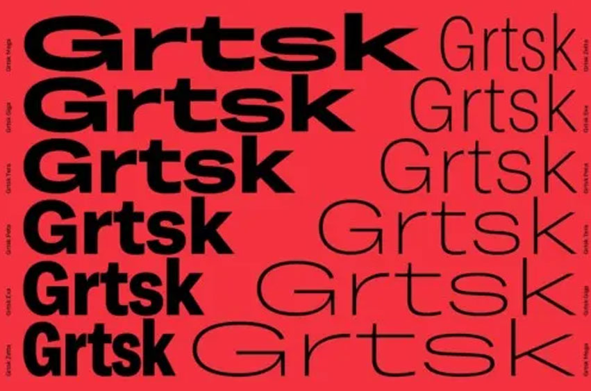
Grtsk Font is a cool and authentic sans-serif font family. Grtsk can be used in many contexts from funky to serious. With weights ranging from thin to bold, widths variations from narrow to extra wide, and 15 degrees slants and back-slants, now the only limit for your typographic layouts is creativity. How about a little bit of physics? In total Grtsk has 7 widths named after metric prefixes: Zetta, Exa, Peta, Tera, Giga, and Mega with the Zetta 10²¹ being the narrow width and Mega 10⁶ extra wide.
Grtsk Peta 10¹⁵, which is right in the middle, has classic widths and proportions. Grtsk’s curves are drawn with high precision making sure all 126 fonts are fully compatible with perfectly controlled interpolations. The typeface natively covers Extended Latin and Cyrillic scripts, and as all Black[Foundry] fonts it embeds full sets of currencies, large range of symbols, fractions, and arrows. Grtsk has one extra glyph to represent the concept of waves ⌇ (mapped to Unicode U+2307), freely interpreted to illustrate the smooth variability of the design. While the design is inspired by the grotesques of the end of the 19th beginning of the 20th centuries, Grtsk is perfectly suited to various contemporary uses in print as well as in digital environments.
The underlying idea is to stay neutral like the classic fonts of the middle of the 20th century, but add a little bit of warmth and personality, a mix of humanist and rational forms, walking the thin line between mechanic and humanist forms. Think about it this way – it’s a design that is one foot in Switzerland with the other in France. Combining a hundred and twenty six weights/widths/styles into one single font offers unprecedented versatility and ubiquity. Grtsk takes full advantage of variable font technology. With one single font file that would otherwise weight 10Mb it now only weighs about 900Kb.
Grtsk Font Preview


Personal Use Only



Leave a Reply