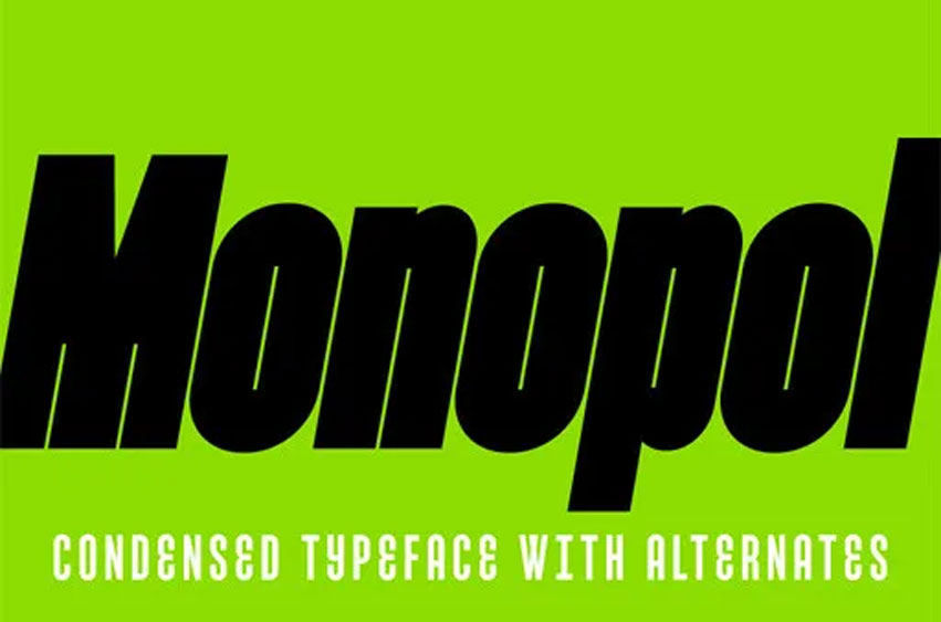
Monopol Font Family is a classic condensed sans serif font with medium contrast strokes. In the late 1950s, Swiss typographer Adrian Frutiger returned these fonts to the spotlight. His extensive type system Univers contained not only several weights of the regular style but also extremely expanded and condensed styles. The Monopol typeface draws from Frutiger’s legacy, yet it is enriched with new, advanced tools of expression. Strict, technical alphabets, especially those based on straightforward geometric principles, are best suited for condensing as they are not limited by the classic proportions of traditional text faces typical for Latin script, in which alterations to horizontal proportions feel odd, unnatural and unpleasant because they oppose tradition and reduce legibility. Monopol is a monolinear sans-serif face – tall, slender and elegant, allowing most text to fit onto a single line. It is always sober and serious and, when set, it is reminiscent of rows of soldiers on parade or a line of fence planks, only occasionally disturbed by a small space or knot. The type family consists of six well-distinguished weights, from fine hair lines to lines black as the deepest night which, by current trends, is darkened to the very limit of technical possibilities and legibility, with the counters reduced to mere hair lines.
All italics have the same proportions as their corresponding regular styles, emphasizing the block-like appearance of the set text. Monopol was specially designed for posters, exhibit stands, book covers, and magazines, as well as in complex visual styles. Its twelve styles make it an ideal tool for creating a dynamic composition using solely typographic means. Similarly to all our display fonts, Monopol boasts some special typographic functions that make it a breeze to use while improving the overall appearance of the text: in particular, this concerns upper case punctuation, tabular figures, and specifically the OpenType style sets. These dramatically change the appearance of the text by replacing the default shapes of selected letters with special alternatives. For example, the typeface contains a “double-bellied” “E” where the stem of the “E” is replaced with two bowls, an I with two horizontal serifs, a rounded “A”, an old-fashioned “a“ with a single bowl, or a bumpy lowercase “r” with anabolic, flabby outstroke in the upper section. In the framework of a single-type family, Monopol thus offers a good-quality display face as well as a journey into the history of sans serif.
Monopol Font Preview


Personal Use Only



Leave a Reply