


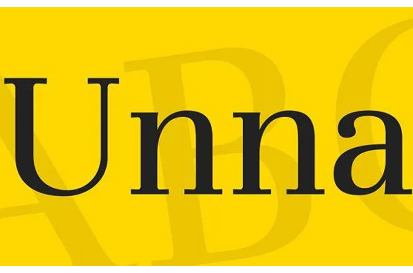
Unna Font appears elegant and has a delicate and round stroke, in its serifs, while the stems are thick, which enhances the neoclassical element of the font, its vertical structure.
As for the name given to this design the type designer, Jorge de Buen, followed the intentions and basically used the name of his mother’s surname.

Personal Use Only


Leave a Reply