


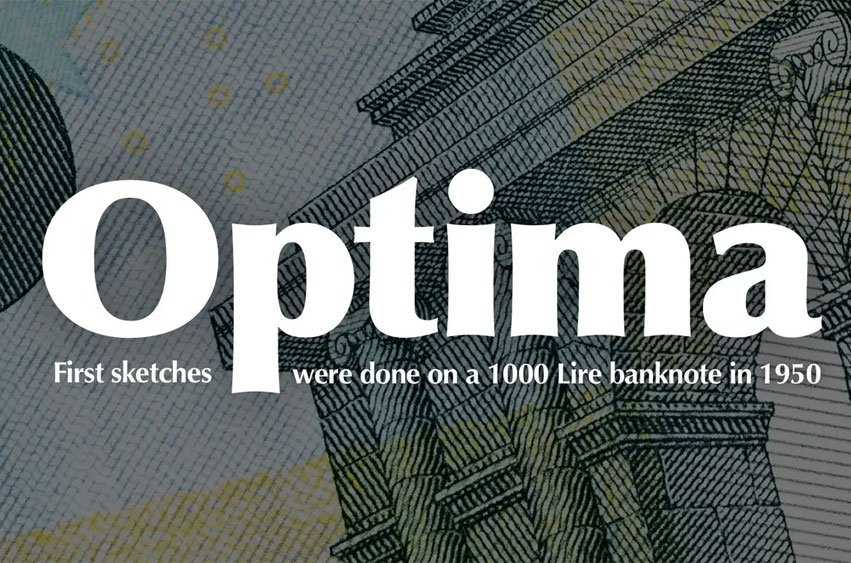
Optima Font Hermann Zapf designed Optima as a humanist sans serif typeface released by D. Stempel AG foundry of Frankfurt, West Germany in 1958.
Although classified as serif sans, Optima features small serifs at both ends to give it a distinctive serif appearance. Zapf discovered Optima during his visit to Florence where it could be found carved onto Renaissance-period gravestones as well as classical Roman capitals.
Zapf designed Optima as an adaptable typeface suitable for body text as well as for titles. He demonstrated its versatility by setting his book about alphabets entirely in regular weight text. Over the decades Zapf kept working on variations and expanding upon this style even into his 80s.
As befits its Roman roots, Optima features wide, fully-bodied characters in its capitals; E, F and L characters have narrower width. Like other Zapf designs this cap S is high-heavy and tilts slightly left; there is also an M that spreads while N contains small vertical strokes similar to serif fonts; lowercase letters a and g are two-story designs with high legibility.
Optima Font Preview


Personal Use Only


Leave a Reply