


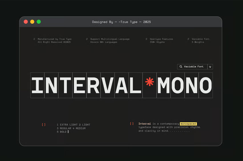
Interval Mono Font has the quiet strength of simple letterforms—particularly those found in classic monospace and geometric typefaces. Their clarity, structure, and rhythm inspired me to create something that felt equally balanced but more adaptable for today’s design needs.
With TBJ Interval, I focused on consistent widths and clean lines, building each character with precision and restraint. While its foundation is rooted in geometry and a modular grid, subtle details in select glyphs help bring a human touch—making it feel less mechanical and more approachable.
TBJ Interval Includes:
- Light, Regular, Bold
- Uppercase & Lowercase
- Numerals and Punctuation
- Accented characters
- Multilingual Support
- Unicode PUA Encoded
- OTF, TTF, WOFF
The result is TBJ Interval — a modern monospace sans serif designed for clarity, rhythm, and versatility. Whether used in branding, editorial layouts, user interfaces, or code, Interval delivers a strong typographic voice that’s both functional and refined.
Interval Mono Font Preview


Personal Use Only


Leave a Reply